Skip to content
ScienceUX

Make science clearer

We use design, communication, and technology to help people communicate scientific work more clearly.

Talk to us

Have a project, idea, or question? Tell us a little about it and we'll get back to you.

Opens in your email app, addressed to team@scienceux.org

What we offer

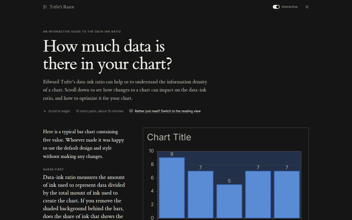
Tufte’s Razor, the interactive data-ink guide: a cluttered bar chart beside the question of whether erasing its background moves the data-ink ratio.

Data Visualization

Good data visualization makes complex data easier to understand and helps people see what matters.
  • Communication
  • Technology
Learn More
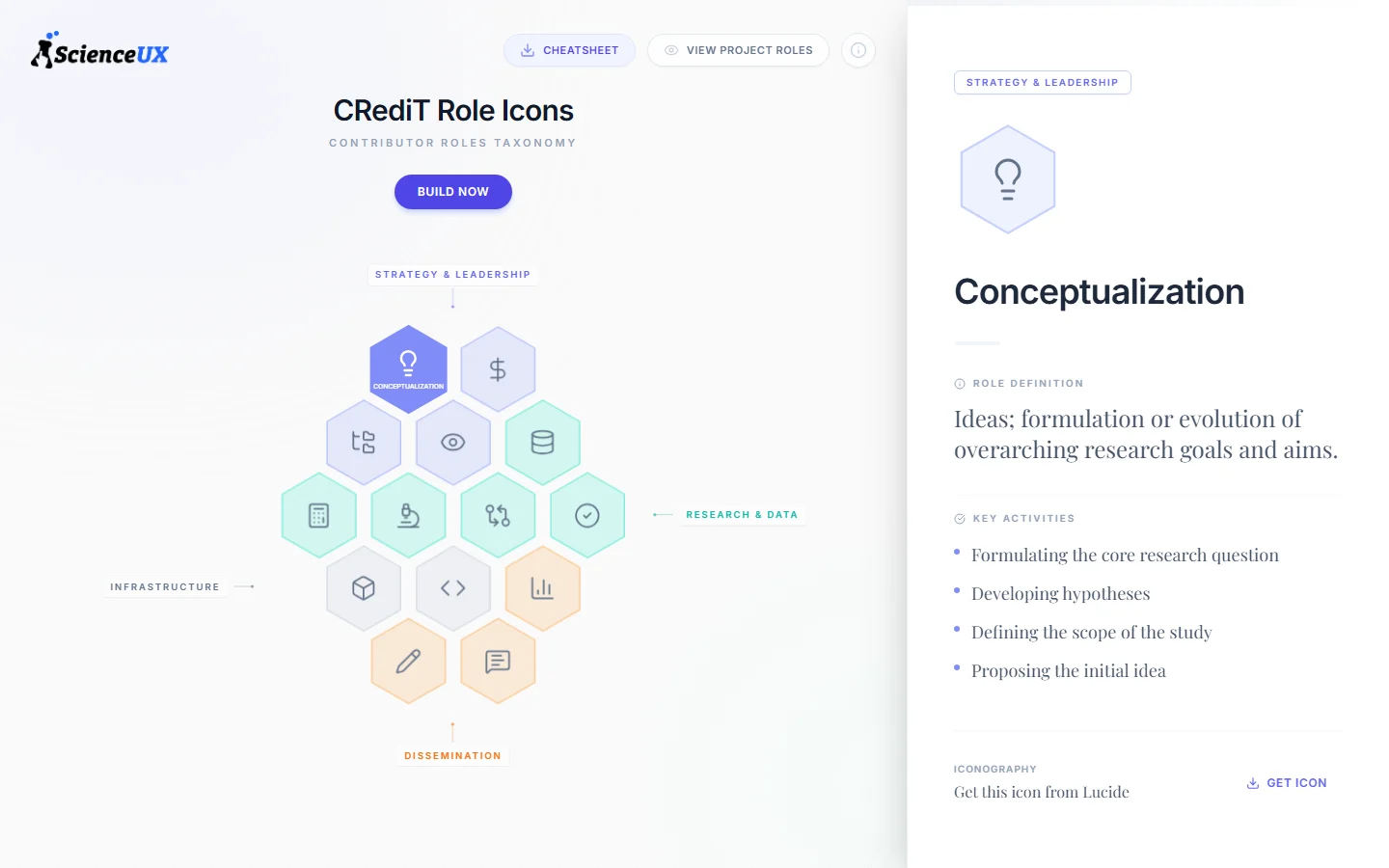
The CRediT Role Icons site: a honeycomb of contributor-role icons grouped into Strategy & Leadership, Research & Data, Infrastructure, and Dissemination, beside the Conceptualization role's definition.

CRediT Role Icons

The CRediT Role Icon Project explores how better UX can increase CRediT adoption and awareness among journals and authors.
  • Technology
  • Communication
View Project (opens in a new tab)
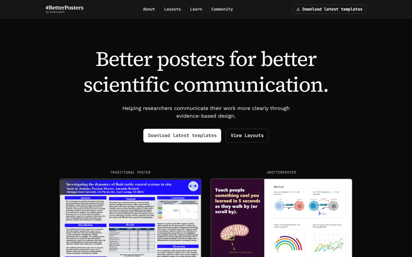
The #BetterPosters home page: “Better posters for better scientific communication” above a traditional poster and a #betterposter side by side.

#BetterPosters

Evidence-based scientific poster templates helping researchers communicate clearly through thoughtful design.

  • Communication
  • Technology
View BetterPosters (opens in a new tab)

Research & resources

Explore our research, guides, and articles on data visualization and communication.

  • Article6 min read

    Minimalist data visualizations aren't necessarily ideal

    The Story of Goldilocks and the Three Charts

  • Video2 min watch

    Start playing with computational articles

    More engaging, more reproducible scientific articles that are the future of publishing.